CLICK HERE FOR THOUSANDS OF FREE BLOGGER TEMPLATES »
Showing posts with label branding. Show all posts

Monday, October 13, 2008

Artist name:

After Liam's cracking idea of 'Boy Interrupted' and his reasoning for this, I thought i would jsut post some info to clarify it.....

Girl, Interrupted is a best-selling[1] 1993 memoir by American author Susanna Kaysen. In the book, Kaysen relates her experiences as a patient in a psychiatric hospital in the 1960s after being diagnosed with borderline personality disorder. The memoir's title is a reference to the Vermeer painting Girl Interrupted at her Music[2].

The plot of Girl, Interrupted does not follow a linear storyline, but instead the author provides personal stories through a series of non-chronological vignettes and personal reflections on why she was institutionalized.

In April 1967, 18-year-old Susanna Kaysen is admitted to McLean Hospital, in Belmont, Massachusetts, after attempting a half hearted suicide. She denies it was a suicide attempt to a psychiatrist who suggests she take time to regroup in McLean, a private mental hospital. Susanna is diagnosed with borderline personality disorder, and her stay extends 18 months[5].
The film is rated R by the MPAA, for strong language and content relating to drugs, sexuality, and suicide.

Themes:

  • mental illness vs. conformity
  • hospitalization as treatment
  • treating the brain vs. the mind
  • freedom

Matt

Friday, September 12, 2008

Logo

Was just mucking about on Paint Shop Pro and knocked up a quick band logo for HRH idea. Was wondering what everyone thought. The distorted font and the black on the white make it distinctive, whilst it is still pretty ambigious as to what HRH stands for and if they are actually a band, which would help create audience interest. Tell me what you think!

Wednesday, September 10, 2008

Psycho Image

The main guy in our music video will have a deluded aura about him. We think that he will be jealous of the other guy in the video, because he has stolen the girl from our protagonist.
We want him to be completely obsessed with revenge and give him a very emo look.
Inspiration for this idea:
Memento - the way the main character writers phrases on himself with tattoos to remember things. This is a very interesting and powerful image and will reflect the character's fixation.

Paramore Riot Album cover - I like the style of this cover as it shows emotion through quite a visual image and reflects the compulsion of the character. The random nature of both the font and where the words are written also depict the mindset of the character as being confused well.

Liam

Tuesday, September 9, 2008

5ive propsal

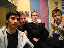
Band member profile pics:
Liam/ Kieran:

In terms of this band member he appears to be the street casual normal guy.

Matthew/ Reece:

In terms of the band he can be the cheeky smiley one.

James/ Jamie/RJ:

As a band member he is the kind of surfer dude who lives the rural/coastal laid back lifestyle.

Michael/ Mikey:

And here is the poser of the band who is really trending and individual.

- Although these people appear to have and would appeal to different tastes it is very plausible that they are close friends and are a truely constructed band (not manufactured).

Matt

Monday, August 11, 2008

5ive proposal: Band Branding

BAND BRANDING:


  1. Here i have created the potential band members of our proposal as WeeMee characters. They each have a unique, virbant look to attract different members of the target audience.
  2. One thing i have done is given them all the same belt as i thought possibly our band could bring out a belt of their own as merchandise for the marketing and future success of our band.
  3. Originally i thought of the three characters furthest right as this is the main idea i had for the look of the band. However conventionally there is a more ragged bandmember who gets lots of press. Therefore i created this more urban down to earth looking male- seen furthest left. I think this widens the potential core audience.
  4. With the name and logo i think EN3 stands out more to the audience and the fact it is a postcode (mine lol) doesn't devalue the fact that is could be an iconic symbol for the band. In particular the font i have chose helps to put emphasis on this symmetrical symbol.
  5. More than this i can imagine this logo on the band members' belt buckles.

Matt